Branding
Brand IdentityLogo Design
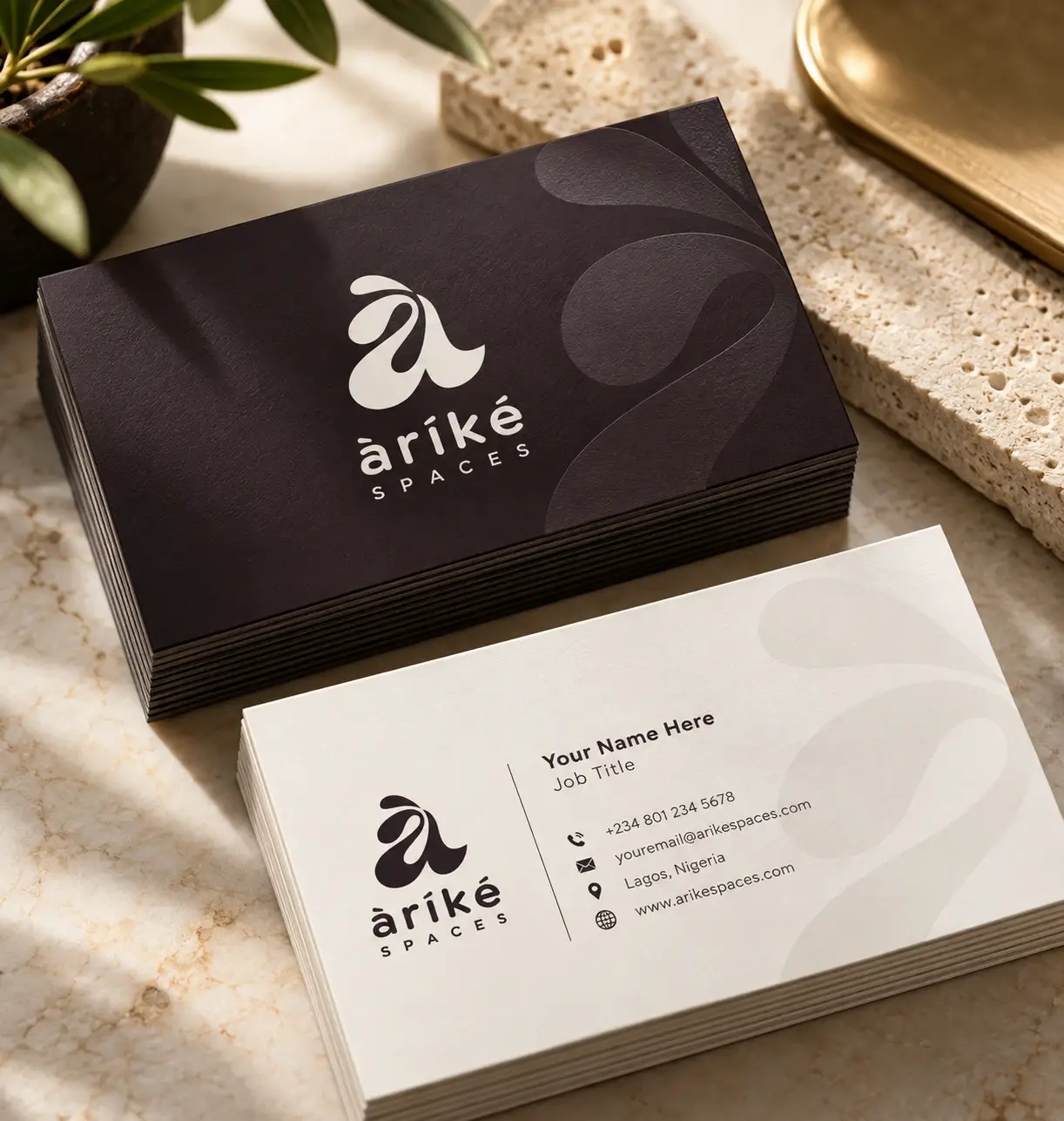
Arike Spaces business cards in grape and cream

01 · The mark

A flowing à

The logomark is a single, flowing à drawn from the name àríké, with its Yoruba tone mark kept as part of the shape. Soft curves and open spaces give it the feel of a hand-crafted object, at home on a business card, a wall or a label.

Arike Spaces logo system: full logo, emblem, logomark and wordmark

02 · Colour

Warm, calm, grounded

Grape leads, softened by Khaki and Pale Slate and anchored by Shadow Grey. Together they feel like natural materials: wood, linen, stone and clay, the textures of a well-designed room.

Arike Spaces colour palette

03 · Spaces and signage

A brand you can walk into

Outside, a softly lit square sign marks the studio. Inside, the logo sits quietly on a warm wall, and a “Live Beautifully” poster shows how the brand frames the rooms Arike Spaces creates.

Arike Spaces illuminated shop sign
Arike Spaces logo on a warm studio wall with a wooden chair
Arike Spaces Live Beautifully interior poster

04 · Brand in use

Made to be lived with

The identity carries naturally onto the things people keep: a grape canvas tote and cream cap, and a signature scented candle wrapped in the brand’s rich, warm tones.

Arike Spaces grape tote bag and cream cap
Arike Spaces signature scented candle